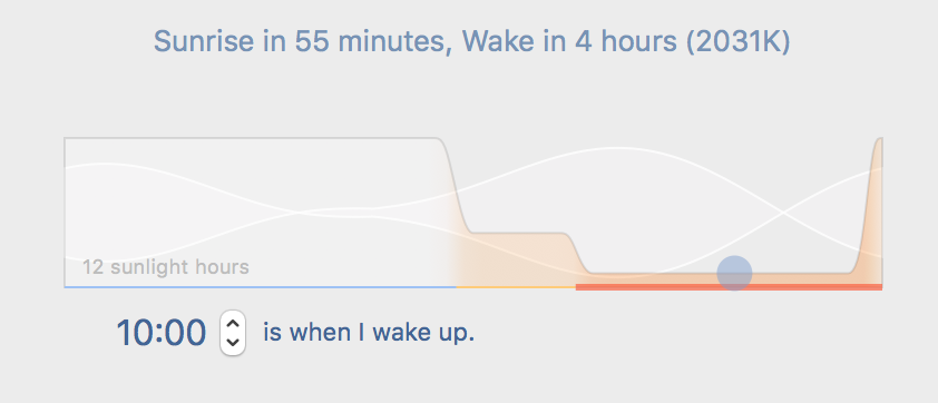
What the diagram in preferences means?
-
I have tried to understand what that diagram represents many times, but failed.

I see there is a lot in it. But the only thing I figured out is that the y-axis means color temperature (correct me if I wrong).
Could someone explain what all elements mean?- what’s the white wave on the background? why there are two waves?
- what’s on x-axis?
- what’s the blue circle? why it moves left when I increase wake up time?
- what’s dark orange line on x-axis? why it became bold in some blue circle positons?
- what’s light orange line on x-axis? why it became bold?
- what’s blue line on x-axis?
- what 'N sunlight hours' means? is it an amount of hours my screen works in sunlight? or it’s hours my eyes exposed to sunlight? or it’s how much sunlight I need with such a schedule?
I’m really confused with that diagram.
-
The two apparent curved lines is really a shaded section outlined by white lines so that it stands out better. It's a representation of how sensitive to light you likely are. The "fatter" it is, the more sensitive to light you likely are. It's based on scientific research.
The circle represents you. The circle's location on this light sensitivity 'graph' tells you what your sensitivity to light most likely is. At the time of your screenshot (provided all of your settings are accurate for you), f.lux was telling you that your sensitivity to light was on the decline, which makes sense because it was saying you wake up in 4 hours. The 'x-axis', as you described it, is where you are the least sensitive to light (in all likelihood, based on scientific research).
The dark orange line is bedtime mode.
The light orange line is sunset mode.
The blue line is daytime mode.
I don't have the Mac version (I have the beta version for Windows, which is very similar to the Mac version), but I think "12 sunlight hours" means that f.lux goes into daytime mode for 12 hours. So, I guess it's telling you that you could go out and get 12 hours of sunlight if you wanted to.