Feedback regarding changes in v4.28
-
All great and no bugs encountered so far.
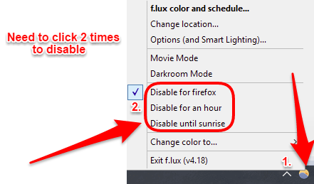
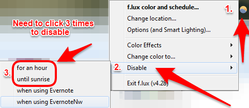
I just have one little qualm with the latest right-click menu change that I dislike. The disable action was moved from the main right-click menu to a sub-menu and now this action needs three mouse clicks instead of only two. The previous iteration was a lot better IMO! I regularly (daily) use this in the evenings when I don't want f.lux to be on yet.
There are three possible solutions as I see:
- return to previous right-click menu sorting,
- give an option to choose between the two different right-click menu styles,
- give us another hotkey combination - current alt+end only disables f.lux for an hour, we need one for disabling until sunrise too if the right-click menu will stay in it's current form.
Hope you will listen to user feedback and incorporate some sort of fix.
Thanks for an awesome product and a pretty quick development cycle in the past days!
EDIT: I see I should've posted in the beta sub-forum. :confused:
-
Thanks for your feedback (and I just moved your post to beta for you).
I am running 4.28 right now and disable is still in my right click menu, is there another place you were wanting to use it?
-
@lorna said in Feedback regarding changes in v4.28:
Thanks for your feedback (and I just moved your post to beta for you).
I am running 4.28 right now and disable is still in my right click menu, is there another place you were wanting to use it?
He means it takes more clicks. Previously, we just right-clicked and left-clicked one of the 'Disable' options. Now it's right-click, aim mouse onto sub menu, move mouse to preferred 'disable' option (and hope you don't fall off the menu), and then left-click.
Even though I never use it, I can see that the previous menu setup for this is quite superior and much easier to use. So, this is just a matter of 'form follows function', but this menu is putting the form before function.
-
@TwoCables said in Feedback regarding changes in v4.28:
@lorna said in Feedback regarding changes in v4.28:
Thanks for your feedback (and I just moved your post to beta for you).
I am running 4.28 right now and disable is still in my right click menu, is there another place you were wanting to use it?
He means it takes more clicks. Previously, we just right-clicked and left-clicked one of the 'Disable' options. Now it's right-click, aim mouse onto sub menu, move mouse to preferred 'disable' option (and hope you don't fall off the menu), and then left-click.
Even though I never use it, I can see that the previous menu setup for this is quite superior and much easier to use. So, this is just a matter of 'form follows function', but this menu is putting the form before function.
@lorna, exactly like @TwoCables said in the quoted text.
Here are the pictures of what I mean:
Previous versions had a menu like this:

The latest version changed it to this (which is worse IMO):

-
And sure, it could be argued that this isn't a small change. If you look at it as just adding 1 click, then an argument could indeed be made that it's not a big deal. However, this is more than just being 1 more click; it can sometimes take more than one attempt to navigate the mouse onto the submenu because of bad mouse aim. Submenus can be very annoying and can cause the user to never look forward to having to deal with them.
-
Yes, I was avoiding doing this for exactly this reason.
Lots of people have asked to put off "bedtime mode" as an alternative (more of a "push back" rather than a "disable totally") so we have MORE menus to add. We can't have ten kinds of disable in this menu or nobody finds the settings.
Maybe we should bring back "for an hour" to the top level for now.
-
@herf said in Feedback regarding changes in v4.28:
Yes, I was avoiding doing this for exactly this reason.
Lots of people have asked to put off "bedtime mode" as an alternative (more of a "push back" rather than a "disable totally") so we have MORE menus to add. We can't have ten kinds of disable in this menu or nobody finds the settings.
Maybe we should bring back "for an hour" to the top level for now.
Make it configurable. Give, let's say three slots you can select your favourites, and all others go to a sub-menu.
So it would say, for example:- Disable For An Hour
- Vignette Mode
- 3400K / 6500K toggle
- -> Colour Effects
- -> Change Colour to
- -> Disable
-
Some thoughts:
-
@Pegart how often do you disable until sunrise? have our "per app" options and schedules not worked? I could imagine people who stay late at work a few nights a week (in a bright room) would use this a lot but I would love to hear your thoughts
-
@JohnEdwa we should do more like this, but it should probably not be in a right-click menu, maybe a popup with a few things to click.
Have been looking at a bunch of alternatives, and am leaning towards leaving the "Disable for an hour" feature in a sub-menu, and mainly this is because we have a hotkey for it (Alt-End), not because it's convenient there.
-
-
@herf, I use it daily actually. I'm a night owl and tend to go to bed very late at night (3-4 am) since I can sleep in in the morning ATM (can afford waking up between 11 am and 1 pm). Dusk comes early in the evening which means f.lux filter goes into effect quite a few hours too early for me. I basically have to disable it until morning (and enable it back at around midnight or 1 am) every night because the one hour option is not enough for me since I start disabling it at around 6 pm to 7 pm.
I basically need f.lux to be disabled from late afternoon to (late) evening - approximately 5 pm to midnight.
Maybe I'm using the scheduler wrong or I'm missing something. Is my earliest wake up time the only scheduler setting there is?
I had another idea if it's not already implemented and I'm somehow not finding it. A scheduler that would allow us to set the hours of f.lux being disabled. This way I could set it not to get enabled before a specific hour in the day.
-
@Pegart I think our new schedule should work just fine for this - set your wake time and try the "working late" preset to get started.